Wednesday, February 25, 2009

web design to shout about


These websites are done by the crew at studio robot, as well as the web design for 78 records, the ballroom, red stripe clothing, etc, etc. they are really amazingly cool pieces of work. They often use a lot of neutrals with splashes of colour in important places like buttons, which emphasizes links. also, the simplicity of the colour scheme makes the design easy on the eyes, very unique amongst ad-crazy sites and the constant movement of the web. they often involve calligraphic, stately text and flourishes, as well as a juxtaposing image or text in a grungier style. some of the images look pencil-drawn or relief printed. they have made the website easy to use and great to look at with a collage style design. they are very good graphic artists, my heroes!
do check out these sites when you're bored, they've got some cool galleries and things:

Thursday, February 19, 2009

These guys do know how to advertise

Insight's advertisements are always q-u-a-l-i-t-y, and i especially like this one, from monster children mag. It is an invigorating and energetic image that really attracts the eye.. well, my eyes..
First off, they have used a primary colour scheme, which is very bright and playful, creating a child-like simplicity to the image. also, the bright intensity of the colour scheme contrasts with the logo (top left corner), being black and white, helping it to stand out. The brand's logo is easily recognisable as they are so well-established in youth culture, and the target audience of the containing magazine, that they can get away with such a small logo in ads. The photograph- by the incredible Dustin Humphrey- is fully.. well.. real, not a computer
+scissors+glue baby. His photographs for this campaign have a surreal nature that captures viewers (such as myself) to look again, and maybe say "yay, insight is awesome". I think it worked. The ad is composed with the rule of thirds, with the lady and the surfer in the cross lines of the thirds. Also, the bottom third is separate, in colour and theme, from the top thirds, but the image puts them in the same scene, completing the surreal look by defying the conventions we are used to. There is a fair bit of negative space between these two main subjects, but their focus on each other closes the gap.
These photographs from insight remind me of Salvador Dali's paintings of the ocean like this.. and others that i can't for the life of me find on the net.

see more of Insight's ads

Wednesday, February 18, 2009

baaaaaad


This is soap that belongs to my sister, sporting some of the worst graphic design around. It is monochromatic, so it doesn't stand out much; but that isn't what bothers me about this little gem. It might have something to do with the overpacked label covered in starnge religous text, all done in butt-boring sans seriff/tahoma like font. This makes the label very hard to read and very unapealing. The little logo for the 60th anniversary isn't bad, and the design follows an 1800's style. but still, yuck, i wouldn't buy this product, i'd see it at my hippy-aunt's house.
oh, and the composition! it's very messy, there's no order or interest. lots of unity and stuuf, but nothing to break t up really. sorry the pictures are so bad, no time. no energy.

Wednesday, February 11, 2009

FOUND magazine- all the way!

I almost love this magazines' design as much as i love the magazine itself. i found it on this website, and of course i had to buy it. It's a collection of found items sent in by the general public and put together by Davy Rothbart. I think it's Davy that compiled the cover, but it's not specified.. The design (and entire magazine) is done in a very DIY style, and Davy has scanned in a heap of grass, paper, labels and photos to make this collage. Very simple but very suited to the idea of the magazine, to show us glimpses of other peoples lives on little scraps of paper, no copyrights, no proffesional works, just finds.
I particularly like the logo, at the top of the cover, and the circus style typography used. It's very bold, and although its a classic font, it is printed in a very street/grunge style. This matches the awesome photograph featured too!
LOVE the idea behind this project, and i encourage you to check out the website.
http://www.foundmagazine.com/


Thursday, February 5, 2009

goo- sonic youth

One of the best album covers known to man.
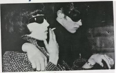
This album was released in 1990 by, of course, sonic youth. Kevin Reagan designed the cover of this album using a drawing by raymond pettibon, which is inspired by a newspaper photograph of maureen hindley and david smith, this makes the image a bit scarier!
It's reminiscent of the pop art movement of the 60's, especially the work of Roy Lichtenstein (gotta love that guy). The art creates instant intrigue, because it is a story half-told, like one scene from an epic comic book of sorts. This helped the band get an interest from consumers as they weren't too mainstream before this album. the solely black and white style is a common artistic trait for raymond pettibon, and creates a lot of contrast. this is such a striking image, and almost forces the consumer to pick up the album and take a look. The angled image creates an edgy look heightening the sense of action. the type is scrawled, as it is on most of sonic youths album art, so that old fans of the band recognise it immediately. not much negative space is included, but they pulled it off fantastically well.

Wednesday, February 4, 2009