Monday, June 8, 2009

more more more more more more more more more more more more more more


early sunday morning last week and im grudgingly trying to sell books to nasty customers, when i notice the distinct use of swiss style design on their credit card. i ponder this for a moment before snapping back to the cruel reality of work. i am turning into a mad designer.. oh no..
the card looks very modern, even though its is so retro, using helvetica type for a clean approach. all the letters, despite being mashed up, fit the grid really well. i like how the logo-bits are at opposite ends, balancing out the use of orange. i sort of dont like how the design seems to be whingeing at my eyes- "more more more more more more more more more more" but it looks nicer than my bank card so kudos to that.

Wednesday, May 27, 2009


this building, and the cinema paradiso opposite of it in northbridge bring me back to the good ol days. totally 1920s art deco people. and it looks wicked. i really like the font used especially.

Thursday, May 14, 2009

this is some damn fine vodka right here. and i didnt the design was too astounding previous to the drinking, but seeing those old men in helvetica drooling over typefaces and modernist design kinda made me see it in a different way. don't worry though, im not going to start petting things with nice type in my bedroom late at night..

hahah, i just took a look at the website and its just as good (although a bit less suave looking) as the bottle. www.42below.com -it includes a "what can i make with whats in my cupboard?" section. genius.

baaaack to the aforementioned packaging, it looks to me like swiss/international typography style with its' sans-serif (helvetica im thinking?) type. in capitals. everything is lined up perfectly, with horizontals and verticals cobined to create a streamline design, that almost looks as if its taking off. great for your rocket fuels. the colours match the title, which refers to the position of the distillery, 42 degrees below the equator. it makes the drink appear icy cold, which is the only way to drink the shit. blergh. it is also very effective having a bottle shape that is iconic of the brand. such as cola, absolut, and i dunno, fricken vitamin water, everyone does it, so theyve done well to make this stand out. they also managed to make the demon drink look classy. spectalular work 42 below.


Wednesday, April 29, 2009

heroic m&m


I found this poster in the shittiest roadhouse in WA, who couldn't work out how to make me a fricken vegetarian burger. fools.
The poster, however, is really great, and it caught my eye despite being hung up in a stupid position in this dingey shop.
firstly, it is quite obviously done in early modern style; with the characters in a heroic realism stance. the ray bands and gradients are similar to art deco style, but the subject matter is from a leter period. it seems to represent the communist revolution through south america (with the m&m posing as che) , possibly a bit risky as an advertising campain because of the political association. the target audience would probably be too young to realise the seriousness of the connection though.
it is a good design, very centered and bold, and it makes the viewer remember it.
blah.

Monday, April 6, 2009

this is the most amazing web design, found here- http://www.espeluzland.com/
it is very fun to browse, but also a bit creepy. have a look for yourself.

Wednesday, April 1, 2009

chirp chirp

This is cheap monday jeans company. I really like their logo design and website, so im going to chirp about it for a while. The type is all capitals, and very scattered, much like dada style. The skull looks similar to a woodblock print from medieval art. being in black and white, it is very simple, and the white type on black helps it to stand out. the use of a speech bubble unites the image, and gives emphasis on the brand name. I saw this on my friends ass and thought it rude to photograph it so took the images from www.cheapmonday.com. It is definately successful because i remembered it, and i dont remember much. the design is fun and looks upmarket, not.. well.. cheap. :)

Wednesday, March 25, 2009

GDNJSTUKHJM


This is the web design for Darren Hanlon, the man behind 'happiness is a chemical' and 'punks not dead'. Pictured is the main menu, with various images used for links. as you mouse over these, it will tell you where the button leads. The design is a collage of various styles; it uses a romanticism landscape, Art Neaveau borders, and photo cut outs reminiscent of Dada. The typography is sans serif, with some hand drawn text. it is a good quality design that creates interest and encourages the viewer to explore the site. it is a very fun and creative design, and echoes the dagginess of the music it promotes.

Wednesday, March 18, 2009

dadadadadada

This poster is by Eduardo Recife, for Upper Playground clothes. It is done in Dada style, using photo montage for the main image. It also has the iconic slanted axis of Bauhaus designs. There is a lot of negative space, bringing focus to the main image and text. The image overlaps the text and is covered in random floral images. it is very nonsensical and playful, bringing interest to the product and.. well.. it certainly caught my attention.


my computer is slowly die-i-n-g-----a-a------a--a--rg-
-----------gggg


-----ghh

Monday, March 16, 2009

blogging is becoming a drag


do excuse the bad picture, and the fact that i was taking photos of fricken smooch shop. i'm not a fan of smooch shop but i do like this shirt hanging in the window. not sure if this counts as graphic design but i doubt someone took out a fricken lino cut or something equally time consuming to do this. i rather like the composition, how she's been cut off at the whomever she may be. the black and white monochromatic image is a bit striking and makes a statement. i don't know what it would be saying though.. maybe "where's my torso? arg!!"

it's pretty much pop art style.. or somehting similar.. and has a real upbeat feel to it. i is definitley good quality. just a photographic pic.
i have nothing more to say..
ermm..

Wednesday, March 4, 2009

tame that impala

This album art for Tame Impala is really interesting and eye catching. It is a very simple design but works well, and communicates the sound of the band successfully. It is done in 1960s psychadelic style, which is basically how the music sounds. The bands' film clips are similar to this too. the design is very symmetrical and the lines lead your eyes towards the band name at the top. It is done with a tetrad colour scheme, and the black and white stand out the most. It is very balanced and there is a lot of untiy, the only thing that breaks this would be the standard font type. Very fun design and worth a listen too.

Wednesday, February 25, 2009

web design to shout about


These websites are done by the crew at studio robot, as well as the web design for 78 records, the ballroom, red stripe clothing, etc, etc. they are really amazingly cool pieces of work. They often use a lot of neutrals with splashes of colour in important places like buttons, which emphasizes links. also, the simplicity of the colour scheme makes the design easy on the eyes, very unique amongst ad-crazy sites and the constant movement of the web. they often involve calligraphic, stately text and flourishes, as well as a juxtaposing image or text in a grungier style. some of the images look pencil-drawn or relief printed. they have made the website easy to use and great to look at with a collage style design. they are very good graphic artists, my heroes!
do check out these sites when you're bored, they've got some cool galleries and things:

Thursday, February 19, 2009

These guys do know how to advertise

Insight's advertisements are always q-u-a-l-i-t-y, and i especially like this one, from monster children mag. It is an invigorating and energetic image that really attracts the eye.. well, my eyes..
First off, they have used a primary colour scheme, which is very bright and playful, creating a child-like simplicity to the image. also, the bright intensity of the colour scheme contrasts with the logo (top left corner), being black and white, helping it to stand out. The brand's logo is easily recognisable as they are so well-established in youth culture, and the target audience of the containing magazine, that they can get away with such a small logo in ads. The photograph- by the incredible Dustin Humphrey- is fully.. well.. real, not a computer
+scissors+glue baby. His photographs for this campaign have a surreal nature that captures viewers (such as myself) to look again, and maybe say "yay, insight is awesome". I think it worked. The ad is composed with the rule of thirds, with the lady and the surfer in the cross lines of the thirds. Also, the bottom third is separate, in colour and theme, from the top thirds, but the image puts them in the same scene, completing the surreal look by defying the conventions we are used to. There is a fair bit of negative space between these two main subjects, but their focus on each other closes the gap.
These photographs from insight remind me of Salvador Dali's paintings of the ocean like this.. and others that i can't for the life of me find on the net.

see more of Insight's ads

Wednesday, February 18, 2009

baaaaaad


This is soap that belongs to my sister, sporting some of the worst graphic design around. It is monochromatic, so it doesn't stand out much; but that isn't what bothers me about this little gem. It might have something to do with the overpacked label covered in starnge religous text, all done in butt-boring sans seriff/tahoma like font. This makes the label very hard to read and very unapealing. The little logo for the 60th anniversary isn't bad, and the design follows an 1800's style. but still, yuck, i wouldn't buy this product, i'd see it at my hippy-aunt's house.
oh, and the composition! it's very messy, there's no order or interest. lots of unity and stuuf, but nothing to break t up really. sorry the pictures are so bad, no time. no energy.

Wednesday, February 11, 2009

FOUND magazine- all the way!

I almost love this magazines' design as much as i love the magazine itself. i found it on this website, and of course i had to buy it. It's a collection of found items sent in by the general public and put together by Davy Rothbart. I think it's Davy that compiled the cover, but it's not specified.. The design (and entire magazine) is done in a very DIY style, and Davy has scanned in a heap of grass, paper, labels and photos to make this collage. Very simple but very suited to the idea of the magazine, to show us glimpses of other peoples lives on little scraps of paper, no copyrights, no proffesional works, just finds.
I particularly like the logo, at the top of the cover, and the circus style typography used. It's very bold, and although its a classic font, it is printed in a very street/grunge style. This matches the awesome photograph featured too!
LOVE the idea behind this project, and i encourage you to check out the website.
http://www.foundmagazine.com/


Thursday, February 5, 2009

goo- sonic youth

One of the best album covers known to man.
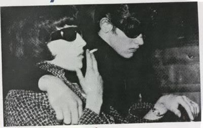
This album was released in 1990 by, of course, sonic youth. Kevin Reagan designed the cover of this album using a drawing by raymond pettibon, which is inspired by a newspaper photograph of maureen hindley and david smith, this makes the image a bit scarier!
It's reminiscent of the pop art movement of the 60's, especially the work of Roy Lichtenstein (gotta love that guy). The art creates instant intrigue, because it is a story half-told, like one scene from an epic comic book of sorts. This helped the band get an interest from consumers as they weren't too mainstream before this album. the solely black and white style is a common artistic trait for raymond pettibon, and creates a lot of contrast. this is such a striking image, and almost forces the consumer to pick up the album and take a look. The angled image creates an edgy look heightening the sense of action. the type is scrawled, as it is on most of sonic youths album art, so that old fans of the band recognise it immediately. not much negative space is included, but they pulled it off fantastically well.

Wednesday, February 4, 2009